Elements of Art
|
LINE
|
A line is a point that travels. Lines can vary in direction, quality, curve, and length.
|
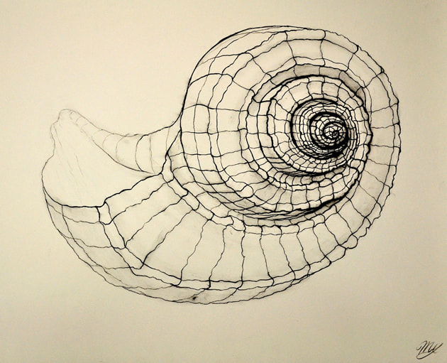
Different qualities of line are used to create the three-dimensional feeling of the drawn shell.
|
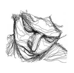
Continuous lines have been used to create the contour of the face but also to imply shadow and depth.
|
Albrecht Durer's creation above uses many different types of line and line quality so that the viewer can identify each element clearly.
|
|
SHAPE
|
Shapes are enclosed flat spaces. Shapes can be geometric (mathematical), or organic/freeform (natural).
|
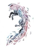
The artist illustrated the image of the fox above using geometric shapes.
|
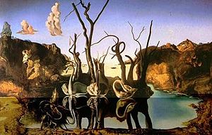
Shapes can be used to imply other shapes, such as the painting above by Salvador Dali. The swans sitting above the water become elephants in their reflections.
|
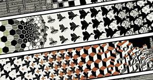
MC Escher is famous for his tesselations; tiling patterns without any gaps or overlaps. He often morphed shapes into creatures.
|
|
FORM
|
Form is three dimensional. Form can also be implied through the use of value and contrast, or negative space.
|
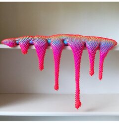
Artist Dan Lam uses form, color, and texture to create "drippy" sculptures that both pull viewers in, but create an uneasy feeling.
|
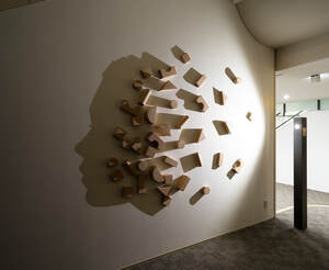
Kumi Yamashita uses the forms of the blocks and the effect of light and shadow to create a cast image of a face in profile.
|
The drawing by Fiona Tang above shows how two dimensional art can have form by playing with value and contrast.
|
|
VALUE
|
Value is lightness and darkness. Value to help a work of art look realistic or flat.
|
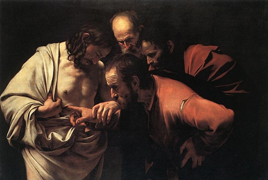
Carravaggio used dramatic lights and darks called "chiaroscuro" to tell his version of bible stories. This gave his paintings a much more intimate, and intense feeling not seen in other artists' work during the same time period.
|
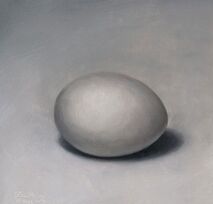
The drawing of the egg would not look realistic without the values created with the lights and shadows. Values and contrast help to create form.
|
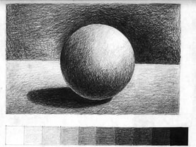
The sketch above shows how lights, shadows, and reflections can help give life to a two dimensional drawing. The scale below the sphere shows the range of values an artist can achieve.
|
|
|
|
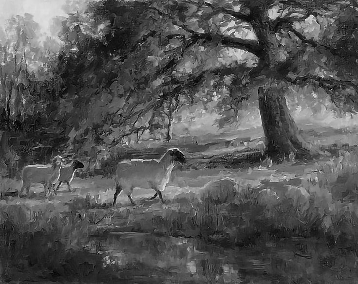
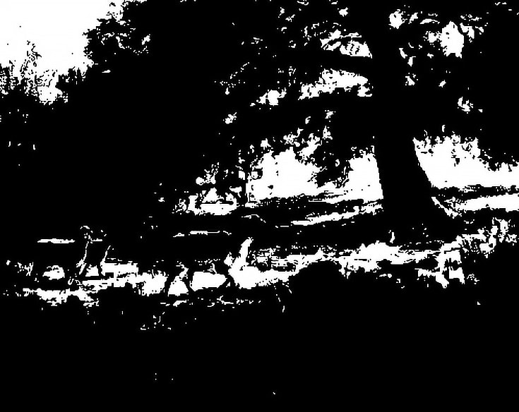
In the article "Two Reasons Why Value (Lights & Darks) Are So Important in Paintings", Dianne Mize illustrates what happens when we turn a color painting into its values, and then shows how important it is to have a range in values to help to describe the structures of shapes using Lilli Pell's painting. Mize notes how removing the color from the painting still allows us to see details and the illusion of form and shape. However, when we remove the differences in value, it's difficult to make sense of the image. See full article HERE.
|
SPACE
|
Space is the area that a work of art is organized. It can help to create depth or emptiness and can refer to the surface of a paper or canvas, or a three-dimensional area of a room or outdoor space. Positive Space is the subject(s) or object(s) shown in an image. Negative Space is the area around the subject(s) or object(s).
|
|
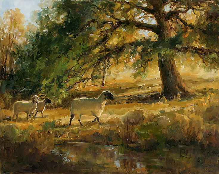
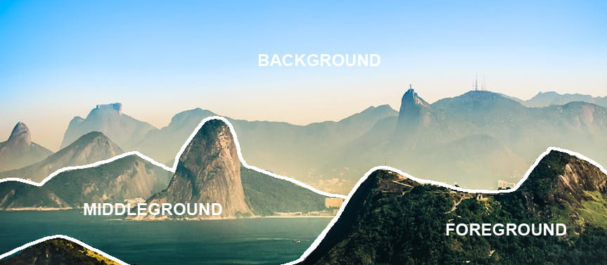
Foreground is the area closest to the viewer. Middleground is the area that is further back from the viewer. Background is the area farthest from the viewer.
|
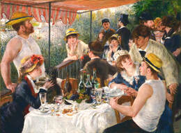
Renoir's Luncheon of the Boating Party is a great example of using foreground, middle ground, and background. The people sitting at the front table are in the foreground. The people sitting and engaging the guy wearing brown in the center of the composition are middle ground and everyone else would be the background.
|
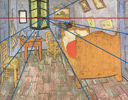
Using Bedroom at Arles, we can see that Van Gogh used one-point perspective to create depth. The blue lines, or orthogonal lines, help to line up the objects to create the illusion of space. The red line, or horizon line, shows the line of sight. All of the orthogonal lines meet at one vanishing point.
|
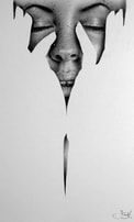
Ileana Hunter's use of negative space is a great example of how something can not exist yet still exist. We don't see hands drawn realistically like the face, but the negative shape of the fingers are easily visible. This method helps create a little drama and emphasis on what is rendered.
|
|
TEXTURE
|
The real or implied "feel" of an object. How it actually feels to the touch, or how it looks like it would feel.
|
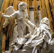
The sculpture above is created out of marble. Bernini was a master at creating texture from stone. One piece of marble can look soft like human skin, flow like bolts of cloth, or look like a piece of wood.
|
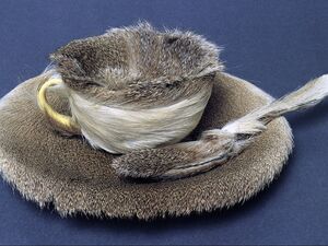
Meret Oppenheim created the furry tea set above. Viewers can visualize putting the fur covered teacup to their lips and drinking liquid from it, which gives most a feeling of disgust or tension. We can feel what that would be like without even having to try it.
|
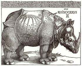
Albrecht Durer sketched a rhinoceros and used multiple different textures to illustrate the hard "armor" of the animal. Although it isn't very accurate to real life, it gives a great impression of how strong this animal might be.
|
|
COLOR
|
The element that is made up of hue, value, and intensity. Color can help to visualize emotion or mood.
|
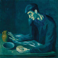
The monochromatic dark blues in the painting by Picasso above has a melancholy, or depressing feel. This emotion is enhanced by the slumped gesture of the blind man and his small meal. Imagine how different it would feel like if it had been painted in bright oranges and yellows.
|
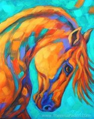
Theresa Paden's use of complementary colors adds to the energy and fighting spirit of the horse. Complementary colors, when put side by side, create intensity.
|
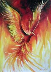
The Phoenix is a mythical bird that rises from its own ashes. The story of regeneration, rebirth, and resilience is shown by Olha Darchuk using bright bold warm colors. This color scheme paired with the dynamic position of the wings gives the feeling of power and freedom.
|
